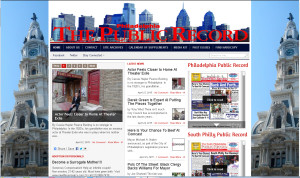
Around 2010 or so, Anthony West, editor of the Philadelphia Public Record, asked me to suggest revisions to the newspaper’s website. At the time, the paper maintained two websites. One contained an archive of older issues in the “Issuu” format (a way of displaying PDFs as an animated newspaper), and the other was an archive of a press-release edition of the paper. Tony also requested that any revision to the website would have to meet a very important goal: the newspaper staff shouldn’t have to learn a lot of complex procedures to post a story to the website.
I proposed an approach where the website would be closer to the actual newspaper, where the material could be cross-posted without any difficulty– for example, they could simply cut-and-paste a story from Word or Quark Express into the site. (Tony and I had worked together on the Friends of Clark Park website, where we followed a similar principle.) I was told that the newspaper’s owner, Jimmy Tayoun, really liked the “Issuu” of older issues, so that had to be incorporated into the design.
So I had to find a design that mimicked the newspaper’s layout. Happily, Gabfire Themes offered several themes that certainly looked good. The theme called Transcript had several advantages. It had a nice, slightly-overcrowded look that the actual newspaper had. It offered several options for the placement of articles and things like Issuu. And best of all, it enabled the editors to “place” stories without having to learn anything terribly complicated.
If you have a look at the site, you’ll notice that the stories appear in several block-areas throughout the page. There’s the Featured Stories “slider” that fades between photos in the upper left. There are the “Latest News” stories down the middle. Further down, there are areas for stories under Business, Opinion, the continuing feature “Pols on the Street,” etc. But the editors don’t have to place the stories by hand: all they have to do is assign a story to a particular category, such as “Pols on the Street,” and the story appears in its proper place. The website handles the layout. And once Tony and I decided which areas should hold what stories, and I gave his staff a quick tutorial on How To Do This, the Public Record site was an integral part of the newspaper’s operation.
From time to time, the paper asks me for some follow-up consultation: adding and testing a particular widget, a minor tweak here and there, a quick round of training for a new staff member. The only major glitch occurred when the site reached the memory limits of the server service they’d purchased, and fixing that required a change in billing and coordinating with tech support to migrate the site.


