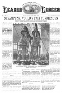
In 2010, the first Steampunk World’s Fair was being organized. My friend Emily Tullis, with whom I’d worked on the Philcon program books, persuaded the organizers to let us design a program schedule for the event. The organizers hadn’t put much thought it, and said they’d figured we’d lay out a schedule grid on some sheets of legal-size paper, which’d be xeroxed and handed out at the con’s registration booth.
Emily and I made another suggestion. “Steampunk” is a design style that adapts and revives motifs of a romanticized Victorian age, ranging from 19th-century costuming styles to the design of machines and equipment using materials of the period, i.e., brass, wood, cast iron, etc. Why not provide a newspaper, probably the finest example of a classic technology being rendered obsolete in our era? It would make for a wonderful keepsake of the event. And if people are walking around dressed in waistcoats, top hats, bustles and corsets, wouldn’t it be more visually fitting to watch them consult newspapers instead of Xeroxed sheets?
The organizers liked the idea, so we went to work. Most of the illustrations used are from 19th century issues of Scientific American, and from Frank Leslie’s Illustrated Guide to the 1876 Philadelphia Exposition, both of which seemed appropriate for a World’s Fair. The captions were written by myself.
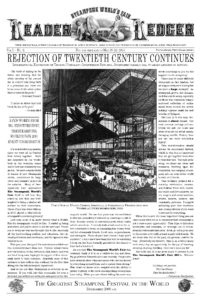
The 2011 edition of the Program Guide could be a little more extravagant: the first Steampunk World’s Fair had done very well, and the production budget was a little larger. And since we now had sixteen pages to fill, we could also throw in some humorous articles to fill some space. These articles are the “Penny Dreadfuls” sections (three pastiches of Victorian/Edwardian adventure fiction) and the “Greetings from Grover Scrofulus” notice.
Clicking on the images should get you hi-resolution PDFs of the program books. If those links don’t work, here they are as text:
https://drive.google.com/open?id=0Bw_MS5tN4rpjYWZVVVBTeW1DTlE
https://drive.google.com/open?id=0Bw_MS5tN4rpjZ18zRWNrNC1QeFE


