The Philcon 2009 Program Book and Pocket Program were high points for me. I really enjoyed doing them, and I like to think that I set a high point for such things. But I have to say up front that, to explain my enthusiasm, I have so say some unflattering things about Philcon.
Philcon, like many old-style science fiction conventions, has seen better days. It used to be part of a general travelling circuit or SF and fantasy writers, as it was only one city away from the Nebula Awards in New York City, and since several SF magazines were edited in Philadelphia, this was a semi-Mecca for the trade. But one needn’t travel to network when the Internet’s available, and “geek culture” has penetrated pretty much everything else in the world– so you don’t need to seek out the occasional Gathering of Fans to get your fix. And the convention circuit’s had a major change, in that we now have large, corporate-influenced Mega-Cons like WizardWorld and DragonCon showcasing most of the major-media action. So this has left a lot of conventions like Philcon relying on an aging demographic of old-style fans of print SF.
But Philcon has persevered since the late 1930s, run entirely by volunteers. I’d done a share of work in years previous to 2009: two years running the Registration system, several years doing layouts for the Program Book and Pocket Program, and I was thinking that maybe 2009 would be my last. And since there wasn’t a lot of supervisory structure within Philcon (i.e., they usually let me do what I wanted as long as I wasn’t blowing budgets), I decided that 2009’s publications were going to be very special.
Philcon’s Two Publications and the Workflow
Philcon has two main publications. The Pocket Program is a handy, hand-held guide to the events schedule. This has always been a difficult project for the con; for one thing, the Philcon scheduling people never got their work done by their deadlines, and frequently, they’d get the Final Schedule done about a week before the con. This usually meant paying printers exorbitant amounts to rush the job. Also, others who’ve typeset the Pocket Program wouldn’t do much to make it easy to work with. Apparently others are fond of scheduling grids– not a bad thing, but when you shoehorn the paragraph-long descriptions of the events into those grids, the layouts wind up unreadable.
So when I started doing the Pocket Program, I decided to do the job right. I decided that it would be no more than four inches wide, so as to fit into a (gasp) pocket. If there were grids, they’d hold titles only. The layouts would avoid having important information broken over pages. I also introduced the use of colored tabs at the edges of the page to mark the individual days of the con.
When I began doing the Pocket Program, the con was moving to an online scheduling system. So I requested that that they build in a feature so I could download the schedule (event title, date, time, room, speakers, description) in a delimited format. I could then use this data to perform a mail-merge, so the titles, dates, times, etc. were formatted properly within a few minutes. So when the Philcon people “finalized” the schedule, I’d do my mail merge, and I would have a finished Pocket Program ready for the printers within two or three hours.
In addition to this, I was also able to take the merge data, reformat it, and upload it into Google Calendar. This way, con participants could access the schedule with their computers, iPhones, and whatever else they used. In other words, I was able to implement online scheduling for Philcon with perhaps five minutes’ worth of work. I’m very proud that I was able to do this.
The Program Book is a larger publication, and more of a keepsake. It’s the size of a small magazine, and its contents usually include a Message from the Chair, sets of rules for conduct during such events as the Art Show, Auction, and Masquerade, a gallery of art from the Artist Guest of Honor, and a list of short biographies of convention participants (called “panelists”). Most of the art in the Program Book is drawn from a collection of sci-fi clip-art that Philcon had accumulated over the years. The Artist Guest of Honor would usually provide digital copies of his work, to showcase in a gallery and on the cover.
I did Program Books for a few years, and streamlined the process as well. A lot of the material repeated from year to year (the rules, mostly) and required only a little tweaking and updating. The Participant Lists required editing by one of the con people, and I made sure that I gave him the materials he needed to work with for a fast turnaround. For the most part, the job consisted of devising a new layout that was readable and attractive, and keeping in touch with contributors so I got the materials on time. Again, generally, things would go pretty smoothly.
Making the Job More Entertaining
From the beginning, I had to throw some things into the project to have some fun. For example, in 2004, the guest of honor as Joe DeVito, who’s done a lot of paperback book covers. A lot of the artwork he provided had some relatively “dead space” in the upper third of the painting, which enables the title to really pop against the background. I could have simply cropped that area out of his artwork. But it occurred to me that, since the Pocket Program was about four inches wide… why not use DeVito’s artwork to make it resemble a paperback book cover? I got Mr. DeVito’s permission first (I wouldn’t want anyone to think that he was parodying his own bread and butter), and made a front and back cover that poked fun at incomprehensible fantasy-novel plots. I got some compliments, no complaints, and one person thought we’d sold advertising space on our covers.
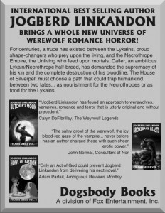
So I got into the habit of throwing these little jokes into the Philcon publications. In one Program Book, I inserted some Karl Kofoed artwork as a comic strip running along the bottom of the page. In others, I’d make mock ads, parodying fantasy and SF novels, and I’d include a fake Panelist Profile for a nonexistent writer named “Jogberd Linkandon.” I have no idea if anyone noticed these things (without my telling them where to look, that is), but they made the job a lot more fun.
2009 and an Unused Idea
I’d had a few ideas to play with for the 2009 Philcon. My friend Emily and I talked about a steampunk look– maybe even using old engravings as the basis of a comic story, like Fuzz Against Bunk or Max Ernst’s collages. Another idea was for an Art Deco streamline-moderne look. But we decided to wait until a Guest of Honor was selected, because sometimes, a guest can be associated with a distinctive art style. Bruce Sterling had been promoting a “Viridian” green-design movement; Cory Doctorow was known for his cyberculture interests; a writer of vampire erotica might prompt us to load the book with wrought-iron, roses, blood drops, and batwing motifs; and military SF design would be severe and constrained. (So much so that, if they went with a military SF guy, I would’ve begged off.)
The Con Chair had a theme for the con already: “The Future is Better than it Used to Be.” He’d worked up a flyer or two to illustrate this. On the left side of the flyer, there’d be something out of old-time SF, like a Star Trek Communicator. And on the right, the modern-day thing that actually came true, like an iPhone. Or a clunky tin-can “robot” costume from 1950 up against a modern-day Asimo robot. I wasn’t a huge fan of the design, but the theme was something I could work with.
The Con Chair wanted to reflect an enthusiasm for the future. Emily and I decided against the stuff I listed above. None of it was particularly forward-looking, except for Deco. But the computer game Bioshock was out that year, and when you marry that style to the Future it can remind people of Italian Futurism (i.e., fascism) or Stalin-era Communist posters. So we talked about postwar design styles that looked to the future.
There were two possibilities. The first postwar style was Googie, that swooping, space-age style that turned up in gas stations, diners, and airports all throughout the 1950s. But the second one was really tantalizing: the Whole Earth Catalog. This was before Steve Jobs died, so his famous commencement address citing the Catalog as “the Internet before the Internet” hadn’t gotten as much circulation as it has now. But I have several editions, and I have a lot of nostalgia for that blend of hippie-era utopianism and hands-on hard work. Hey, I’ve even met Buckminster Fuller.
So I’d considered working up a program book that would resemble the old Whole Earth Catalog. My hope was to ask people to contribute to it, by writing a paragraph about Something They Liked, and typesetting it in the WEC style. This rapidly became the main reason why we didn’t use this idea; getting people to contribute to the Program Book was like recruiting for a patrol in Kandahar. And it’d require gathering a lot of artwork as well.
And sadly, I had the suspicion that nobody would get the reference.
We went with another idea.
The 1964 World’s Fair
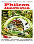
My earliest memory was from the 1964 World’s Fair, of running away from my parents to see the Sinclair Oil Dinosaur exhibit. I still had a few materials from this event, including a thick program book. The more I thought about it, the more than the Fair seemed like the last gasp of a particular kind of future– gleaming, technology-oriented, designed by the likes of GE and Monsanto, and pretty much tossed aside by the era of the Whole Earth Catalog. The design styles of the era were getting a revival thanks to Mad Men, and since the Guest of Honor turned out to be Cory Doctorow, the style was utterly perfect.
So I started assembling graphics to use (thanks to a site called Modern Mechanix– surprisingly run by a friend of Doctorow’s), and tried to use fonts and layouts from the era. (The artwork was stunning, but magazines had boring layouts back then.) I found a lot of advertising artwork that fit the usual departments of the Con– some of which I altered, and some of which I ran verbatim. I also acquired some more old World’s Fair materials and used those as well. And since my workflow for these projects was pretty streamlined already, I had a lot of the thing done weeks before the deadline. I even used the mail-merge schedule system to create large-format posters that would be placed outside of the rooms, displaying the schedule of events there.
But, since this was my last time on the project, I decided to make this really special. Remember that list of things that usually appeared in the Program Book? Well, sometimes, we’d ask a guest to contribute something else: an appreciation of another guest, an excerpt from an upcoming work, etc. This time, I decided to run as much material as was financially feasible. I contacted the guests for material, and acquired reprint permissions for a lot of stuff: song lyrics by guest Katherine Asaro, a lengthy interview with L.A. Banks, a photo spread of writers’ offices by Kyle Cassidy, and more. In other words, this was going to be a real publication, and not just a quick assembly of stuff we had laying around.
(Did we go over budget? Actually no: I found a local printer who was able to price the job below the previous year’s price. There was some unpleasantness when the Philcon people demanded that Emily and I assemble at least three bids for the printing job. My local printer was the lowest by far… and then Emily was told by the Philcon people to “find someone 10% cheaper.” So I sent out a letter explaining that, if we were to go on this snipe hunt, I’d be prepared to publish a bare-bones Program Book with no graphics, no additional material beyond the usual, and no binding beyond a staple in the corner. So Philcon agreed to the full version… which was under budget to begin with.)
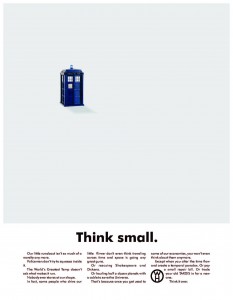
The Pocket Program deserves a small mention. I designed the cover to resemble the cover for the World’s Fair pocket program. This was also where I placed many of the parody ads I’d worked up over the previous year or so.
Anyway, the con begins, and I’m waiting for the printers to deliver the stuff. They ran late, sad to say, and since I’d been giving people the “it’ll be spectacular. You’re going to flip over what I put together for you” sales pitch, a lot of Philcon people were taking the opportunity to express Severe Disappointment in me and my hype. This didn’t bother me very much for two reasons. The first reason was that I’d seen how deadline-conscious they were, and the long history of last-minute reprints, revisions, and huge rush-job bills they’d had to pay when they were running things. The second reason was that I knew what was coming.
The printers arrived at 9 p.m. a few hours late, and unloaded the boxes at the registration table. And a horde of fans immediately clamored around the table and saved me the trouble of opening the boxes by reaching out and ripping them open to get at the tasty schedule books inside. That was the moment for me… because they picked up the program books, with their color Popular Mechanics parody covers, and gave out whooshes of “What the Hell?” and “Wow!” and “Oh my God” and, best of all, fannish giggles at the mock-copy on the cover. I spent the rest of the weekend being bathed in compliments and praise.


